Colour Theory
Colour theory is the study of how colours interact with each other and how they are perceived by the human eye. It helps us understand the principles of colour mixing and the effects of different colour combinations. It guides to use colours in the most effective way. The theory behind colour is complex and involves several different elements, including the colour wheel, colour harmony, colour temperature, colour contrast, and colour psychology.
Principles of colour theory
Colour theory is a fundamental concept in art, design, and visual communication. The principles of colour theory include hue, saturation, value, complementary colours, analogous colours, and the colour wheel. These principles can be applied to create effective designs and communicate specific messages to the audience.
“There is no doubt that creativity is the most important human resource of all. Without creativity, there would be no progress, and we would be forever repeating the same patterns”

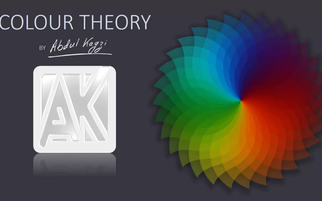
Colour Wheel
A colour wheel is a circular diagram that shows the relationships between primary, secondary, and tertiary colours. It is a tool used in colour theory to help artists, designers, and anyone working with colour understands how colours work together and how they can be combined to create visually appealing designs.
The traditional colour wheel is made up of 12 colours, including the primary colours of red, blue, and yellow, the secondary colours of orange, green, and purple, and the tertiary colours of yellow-green, blue-green, blue-purple, red-purple, red-orange, and yellow-orange. These colours are arranged in a specific order around the wheel, with the primary colours spaced equally apart from each other and the secondary colours located between them.
The colour wheel is useful for understanding colour relationships, such as complementary colours (which are located directly across from each other on the wheel), split-complementary colours (which are located on either side of a complementary colour), and analogous colours (which are located next to each other on the wheel). By using the colour wheel as a guide, artists and designers can create harmonious colour schemes that effectively communicate the desired message or mood.
There are also variations of the colour wheel, including those that feature more colours or those that focus on specific colour relationships. Some colour wheels, for example, may include warm and cool colours or may be divided into warm and cool halves. Ultimately, the colour wheel is a helpful tool for anyone working with colour, providing a visual representation of colour relationships and aiding in the creation of effective and engaging designs.

Primary Colours
There are three primary colours: red, yellow, and blue. These colours cannot be created by mixing other colours together. All other colours are created by mixing these primary colours together in varying amounts.
The primary colours are important in colour theory because they are the building blocks for all other colours. By mixing different amounts of red, blue, and yellow, it is possible to create a wide range of secondary and tertiary colours, which can then be used to create colour schemes and harmonies. For example, mixing equal amounts of red and blue creates the secondary colour purple, while mixing equal amounts of yellow and blue creates the secondary colour green. By mixing a primary colour with a secondary colour, it is possible to create a tertiary colour, such as red-orange or blue-green.
Secondary Colours
Secondary colours are created by mixing two primary colours together: orange (red and yellow), green (yellow and blue), and purple (red and blue).
Secondary colours are important in colour theory because they provide additional options for creating colour schemes and harmonies. By mixing primary colours together in varying amounts, it is possible to create a wide range of secondary colours, which can then be combined with other colours to create even more complex colour schemes. For example, a colour scheme might include a primary colour, a secondary colour, and a tertiary colour, all of which work together to create a visually appealing and harmonious design.
Tertiary Colours
Tertiary colours are created by mixing a primary colour with a secondary colour. There are six tertiary colours in total: red-orange, yellow-orange, yellow-green, blue-green, blue-purple, and red-purple.
Tertiary colours offer a wider range of colours to work with than primary and secondary colours, making them important in colour theory. By mixing different amounts of primary and secondary colours, it is possible to create a wide range of tertiary colours with varying levels of warmth or coolness, brightness, and intensity.
Tertiary colours are particularly useful for creating harmonious colour schemes because they can bridge the gap between warm and cool colours or provide additional shades and tones of colour. By combining primary, secondary, and tertiary colours in various ways, artists and designers can create visually interesting and dynamic designs that effectively communicate their intended message or mood.

Additive colour synthesis and subtractive colour synthesis are two different colour models that explain how colours are produced and combined to create different hues.
Additive Colour Synthesis
Additive colour synthesis refers to the process of creating colours by adding different coloured lights together. This colour model is commonly used in electronic displays, such as televisions, computer monitors, and smartphones. The primary colours in additive colour synthesis are red, green, and blue (RGB). When these colours are combined in equal proportions, they create white light. When different amounts of these colours are combined, they create different hues and shades.
Subtractive Colour Synthesis
Subtractive colour synthesis, on the other hand, refers to the process of creating colours by subtracting or absorbing certain wavelengths of light. This colour model is used in printing, where colours are created by mixing different coloured inks. The primary colours in subtractive colour synthesis are cyan, magenta, and yellow (CMY). When these colours are mixed together in equal proportions, they create black. To create other hues, printers use a fourth colour, black (K), which is added to the CMY colours to create a wider range of shades.

Hue
Hue refers to the purest form of a colour, without any black, white, or gray added to it. It is one of the three main attributes of colour, along with saturation and brightness.
Hue is often described in terms of the colour spectrum, which is the range of colours visible to the human eye. The colour spectrum is usually shown as a rainbow or colour wheel, with red, orange, yellow, green, blue, indigo, and violet being the main colours. These colours are arranged in order of their wavelength, with red having the longest wavelength and violet having the shortest.
Hue can also refer to specific colours, such as “red,” “green,” or “blue.” In this sense, hue is a way of distinguishing one colour from another. Different hues can be created by mixing different amounts of primary colours, such as red, blue, and yellow, or by combining different pigments or dyes.
In design and art, hue is an important consideration when creating colour schemes or selecting colours for a project. By understanding the relationship between different hues and how they can be combined to create harmonious or contrasting colour schemes, designers and artists can effectively communicate their intended message or mood through colour.

Tint
A tint is a lighter version of a colour, created by adding white to the original hue. Tinting a colour makes it appear softer, brighter, and more pastel-like, depending on the amount of white added.
The process of creating a tint involves starting with a pure hue and gradually adding white to it until the desired level of lightness is achieved. For example, a light pink tint can be created by adding increasing amounts of white to a deep pink hue.
Tinting is a useful technique in art and design, allowing artists and designers to create a range of shades and tones from a single colour. Tinting can also be used to create a sense of lightness or airiness in a design, making it a popular choice for backgrounds or as a contrast to darker colours.
Tinting can be combined with other colour schemes, such as monochromatic or complementary, to create more complex and nuanced designs. Understanding how to create tints, and how they can be used effectively in design, is an important part of colour theory.
Tone
Tone refers to the darkness and lightness of a colour, created by adding black and white (gray) to the original hue. Unlike tints and shades, which are created by adding only white or only black, tone is created by adding both black and white to the original hue, resulting in a more muted or subdued colour.
The process of creating a tone involves starting with a pure hue and adding both black and white in equal amounts to create a range of grayish tones. The resulting colours are less intense and vibrant than the original hue, with a more subtle and sophisticated look.
Tone is an important consideration in art and design, allowing artists and designers to create a range of colours with different levels of brightness and darkness. Tone can be used to create depth and dimension in a design, by using lighter tones to create highlights and darker tones to create shadows.
In colour theory, tone is often discussed in relation to the value of a colour, which refers to its relative lightness and darkness. By understanding how to create and use different tones, designers and artists can effectively communicate mood, atmosphere, and emotion through their use of colour.
Shade
A shade is a darker version of a colour, created by adding black to the original hue. Adding black to a colour reduces its brightness and makes it appear deeper and more intense.
The process of creating a shade involves starting with a pure hue and gradually adding black to it until the desired level of darkness is achieved. For example, a deep navy shade can be created by adding increasing amounts of black to a blue hue.
Shades are often used in art and design to create depth and contrast. They can be used to create a sense of drama or intensity, and are often used in combination with other colours to create a balanced and harmonious colour scheme.
Understanding how to create and use different shades is an important part of colour theory. By combining shades with other colours, designers and artists can create complex and nuanced colour schemes that effectively communicate their intended message or mood.

Monochromatic Colour Scheme
A monochromatic colour scheme is a colour scheme that uses variations of a single colour to create a harmonious and cohesive design. This colour scheme typically includes a range of tints, tones, and shades of the same hue.
To create a monochromatic colour scheme, you start with a single colour and then use colour theory principles to adjust the colour to create a range of variations. Tints are created by adding white to the base colour, while shades are created by adding black. To create tones, you can add gray to the base colour.
Monochromatic colour schemes can be effective because they create a sense of unity and cohesiveness in a design. They can be calming and restful to the eye, and they work well in designs where simplicity and minimalism are important. Monochromatic colour schemes are also easy to create and work well in a variety of design contexts, from branding and marketing to interior design and fashion.
Examples of monochromatic colour schemes include using different shades of blue in a website design, or using various tones of green in a nature-themed branding campaign. By using a single colour in different ways, designers can create a harmonious and visually appealing design.

Complementary Colours
Complementary colours are pairs of colours that are opposite each other on the colour wheel. These colour pairs create a high contrast when placed next to each other, making them visually striking and complementary to each other.
The three primary colours on the colour wheel are red, blue, and yellow. The complementary colour pairs are green and red, orange and blue, and purple and yellow. For example, red and green are complementary colours because they are directly across from each other on the colour wheel.
Complementary colours can be used to create a dynamic and visually interesting design. When used together, they can create a sense of vibrancy and excitement. However, it’s important to use complementary colours carefully, as they can be overwhelming if overused or used in the wrong way. For example, using equal amounts of two complementary colours can create a harsh and discordant effect.
One way to use complementary colours is to choose one colour as the dominant colour in a design and use the complementary colour as an accent. This can create a balanced and visually appealing composition. For example, using blue as the main colour in a design and adding orange accents can create a vibrant and dynamic look.
In summary, complementary colours are pairs of colours that are opposite each other on the colour wheel. They can create a high contrast and visually striking effect when used together, but should be used carefully to avoid overwhelming the design.

Split Complementary Colours
A split complementary colour scheme is a variation of the complementary colour scheme that uses a base colour and two colours adjacent to its complementary colour. The result is a colour scheme that creates a sense of balance and harmony, while still providing some of the high contrast of complementary colours.
To create a split complementary colour scheme, you first choose a base colour, and then identify its complementary colour, which is the colour directly opposite it on the colour wheel. Next, you choose two colours adjacent to the complementary colour. For example, if the base colour is blue, the complementary colour is orange, and the two split complementary colours would be red-orange and yellow-orange.
Using a split complementary colour scheme can create a dynamic and visually interesting design that still feels balanced and harmonious. It can be a good option when you want to use complementary colours but want to avoid the harsh contrast they can sometimes create.
When using a split complementary colour scheme, you can use the base colour as the dominant colour in your design and use the two split complementary colours as accents. This creates a sense of harmony and balance, while still providing some contrast and visual interest.
In summary, a split complementary colour scheme is a variation of the complementary colour scheme that uses a base colour and two colours adjacent to its complementary colour. It can create a visually interesting design that feels balanced and harmonious.

Triad Colours
A triadic colour scheme is a colour scheme that uses three colours that are evenly spaced around the colour wheel, creating a triangle shape. This creates a colour scheme that is balanced and harmonious, with a mix of warm and cool colours.
To create a triadic colour scheme, you start by selecting a base colour and then find two other colours that are equally spaced around the colour wheel. For example, if you choose blue as the base colour, the other two colours in the triadic colour scheme would be red and yellow.
Using a triadic colour scheme can create a visually interesting and dynamic design that feels balanced and harmonious. It provides a mix of warm and cool colours that work well together, and the equal spacing around the colour wheel ensures that each colour is given equal weight.
When using a triadic colour scheme, it’s important to use one colour as the dominant colour and the other two colours as accents. This helps to maintain balance in the design and prevents the colours from competing with each other.
In summary, a triadic colour scheme is a colour scheme that uses three colours that are evenly spaced around the colour wheel. It creates a visually interesting and dynamic design that feels balanced and harmonious, with a mix of warm and cool colours. It’s important to use one colour as the dominant colour and the other two as accents to maintain balance in the design.

Double Complimentary Colours
A double complementary colour scheme is a colour scheme that uses four colours that are two pairs of complementary colours. It’s also known as a tetradic colour scheme or rectangle colour scheme because the four colours form a rectangle on the colour wheel.
To create a double complementary colour scheme, you start with two complementary colours, which are directly opposite each other on the colour wheel. Then, you add another pair of complementary colours, which are opposite each other on the colour wheel but not adjacent to the first pair. For example, if you choose blue and orange as the first complementary pair, the second pair could be red and green.
Using a double complementary colour scheme can create a visually interesting and dynamic design that provides a lot of colour variation. It’s a good option when you want to use multiple colours but still want to create a sense of balance and harmony.
When using a double complementary colour scheme, it’s important to use one colour as the dominant colour and the other three as accents. This helps to maintain balance in the design and prevents the colours from competing with each other.
In summary, a double complementary colour scheme is a colour scheme that uses four colours that are two pairs of complementary colours. It creates a visually interesting and dynamic design that provides a lot of colour variation, but it’s important to use one colour as the dominant colour and the other three as accents to maintain balance in the design.

Analogus Colours
Analogous colours are colours that are next to each other on the colour wheel. They are similar in hue and share a common base colour, which creates a sense of harmony and unity in a design. Analogous colour schemes are often used to create a calming or soothing effect, as they are often found in nature.
To create an analogous colour scheme, you choose a base colour and then select the two colours on either side of it on the colour wheel. For example, if you choose blue as the base colour, the analogous colours would be blue-green and blue-purple.
Using analogous colours can create a visually pleasing and harmonious design, but it can also lack contrast if the colours are too similar. To add contrast and interest, it’s often helpful to use a variety of shades and tints of the analogous colours, or to use a complementary colour as an accent.
In summary, analogous colours are colours that are next to each other on the colour wheel. They create a sense of harmony and unity in a design, but can lack contrast if the colours are too similar. It’s often helpful to use a variety of shades and tints of the analogous colours, or to use a complementary colour as an accent to add interest and contrast.

Cold Colours
Cold colours, also known as cool colours, are colours that are associated with water, ice, sky, and other cool elements. They are often used to create a calming and relaxing atmosphere in a design. Cold colours include blue, green, and purple, and their various shades and tints.
Blue is the most common cold colour and is often associated with water and the sky. It can create a sense of calmness, tranquility, and reliability. Lighter shades of blue are often used in healthcare and medical designs, as they are thought to have a calming effect.
Green is another cold colour that is associated with nature and growth. It can create a sense of balance, harmony, and freshness. Green is often used in designs related to health and wellness, as it is thought to promote relaxation and healing.
Purple is a cold colour that is associated with royalty, luxury, and creativity. It can create a sense of calmness and sophistication. Darker shades of purple are often used in designs related to spirituality and mysticism.
When using cold colours in a design, it’s important to consider the context and the emotions you want to convey. Cold colours can be calming and soothing, but they can also create a sense of distance and detachment if used excessively or inappropriately. Combining cold colours with warm colours can create a balanced and harmonious design.

Warm Colours
Warm colours, also known as hot colours, are colours that are associated with warmth, energy, and excitement. They are often used to create a vibrant and lively atmosphere in a design. Warm colours include red, orange, and yellow, and their various shades and tints.
Red is the most common warm colour and is often associated with passion, love, and danger. It can create a sense of excitement, energy, and urgency. Red is often used in designs related to food and drink, as it is thought to stimulate appetite.
Orange is another warm colour that is associated with happiness, enthusiasm, and creativity. It can create a sense of warmth, friendliness, and playfulness. Orange is often used in designs related to sports and leisure, as it is thought to inspire action and adventure.
Yellow is a warm colour that is associated with happiness, joy, and optimism. It can create a sense of energy, warmth, and cheerfulness. Yellow is often used in designs related to children and education, as it is thought to promote learning and creativity.
When using warm colours in a design, it’s important to consider the context and the emotions you want to convey. Warm colours can be energizing and stimulating, but they can also create a sense of anxiety and aggression if used excessively or inappropriately. Combining warm colours with cool colours can create a balanced and harmonious design.

Colour Associations
Colour associations refer to the emotional or cultural meanings and symbolism that people attach to different colours. These associations can vary depending on individual experiences, cultures, and contexts.
For example, in Western cultures, white is often associated with purity, innocence, and cleanliness, while in some Eastern cultures, it is associated with mourning and death. Similarly, red is often associated with love, passion, and excitement in many cultures, while in others it can be associated with danger or anger.
Some common colour associations include:
- Red: love, energy, intensity, passion, danger, excitement
- Orange: warmth, enthusiasm, creativity
- Yellow: hope, happiness, attention, optimism, warmth
- Green: nature, safety, freshness, growth, harmony
- Blue: trust, stability, inspiration, reliability, calmness
- Purple: royalty, luxury, wealth, creativity
- Black: sophistication, elegance, mystery
- White: purity, innocence, cleanliness
- Gray: neutrality, formality, sophistication
When choosing colours for a design or branding, it’s important to consider the colour associations and what message or emotion you want to convey. Colour associations can also vary between different age groups, genders, and cultures, so it’s important to do research and consider your target audience.
» YouTube Creative Zone Link: https://youtube.com/c/abdulkagzi
» Facebook Creative Zone Link: https://www.facebook.com/Creative-Zone-101370095665420
» LinkedIn: https://www.linkedin.com/in/abdulkagzi/
» Instagram: https://www.instagram.com/creativezoneforall/
» Twitter: https://twitter.com/abdulkagzi/
» Pinterest: https://in.pinterest.com/CreativeZoneForAll/
» Quora: https://yourcreativezone.quora.com/
» Books To Read: https://kit.co/AbdulKagzi/the-most-life-changing-books


This is such a timely topic; I’m glad I came across your blog.
Thank You for appreciating…
I have read some excellent stuff here. Definitely value bookmarking for revisiting. I wonder how much effort you put to make the sort of excellent informative website.
hello!,I like your writing very so much! proportion we keep up a correspondence extra approximately your post on AOL? I need an expert in this space to unravel my problem. May be that is you! Taking a look forward to see you.
This piece provided some great insights. The author’s approach was both clear and engaging. I’m curious to see how others feel about these ideas. Any additional thoughts?
The insights in this article are very valuable. The author’s approach to the topic was engaging and informative. I’m curious to hear different perspectives on this. What do you think?
Fantastic article! Your perspective on this topic is truly insightful. For those looking to explore this further, I found an excellent resource that complements your points: READ MORE. I’m eager to hear what others think about this!
I like the efforts you have put in this, regards for all the great content.